I’ve been writing a white paper that included a section on website design and thought it would be interesting to pick a site and see how it had evolved over the last 15 years. Apple has been a design innovator over the last 30 years so who better to look at to see how their site has changed with the times.
Using Wayback Machine I was able to go back and walk through the changes in the Apple site. I expected that with Apple’s creativity I would see a continuous evolvement of their site, but was surprised that over the last 15 years there have only been four significant evolutions to the site.
So let’s take a stroll back the the Apple site circa 1996.
Not the prettiest site but considering the time it was pretty much par for the course. I am curious about the choice of maroon since the color never shows up again.
Next we jump ahead close to two years to May of 1998. this is the first major shift in the apple site.

You can see a precursor to the large hero shots that have recently given way to sliders. Considering this is 1999 they are well ahead of the times.
Next we jump ahead 5 months to October 1999.
Not a big change but just continued development of the hero graphic.
Next stop is February 2000.
The famous tab navigation makes its appearance. There was a time when it seemed that almost every site had tabbed navigation. It was cool then; today it just seems clunky.
Next we move to November of 2000.
The big change is to the content boxes below the main graphic. gone are the colored tables cells replaced with a cleaner graphical element. Not a big change but a huge improvement.
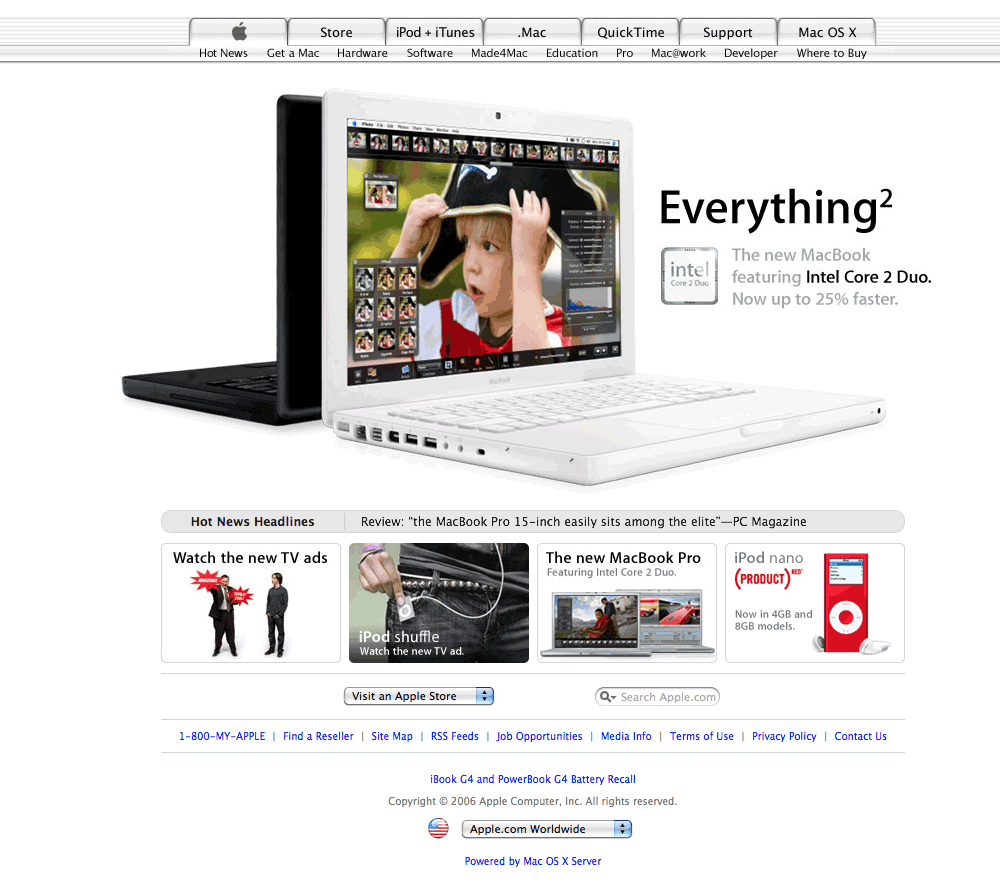
Over the next five years the site would remain unchanged until November 2006.
After five years of nothing Apple updated the footer making it cleaner with added text link buttons. Not that interesting but an update. More interesting to me is watching the product changes.
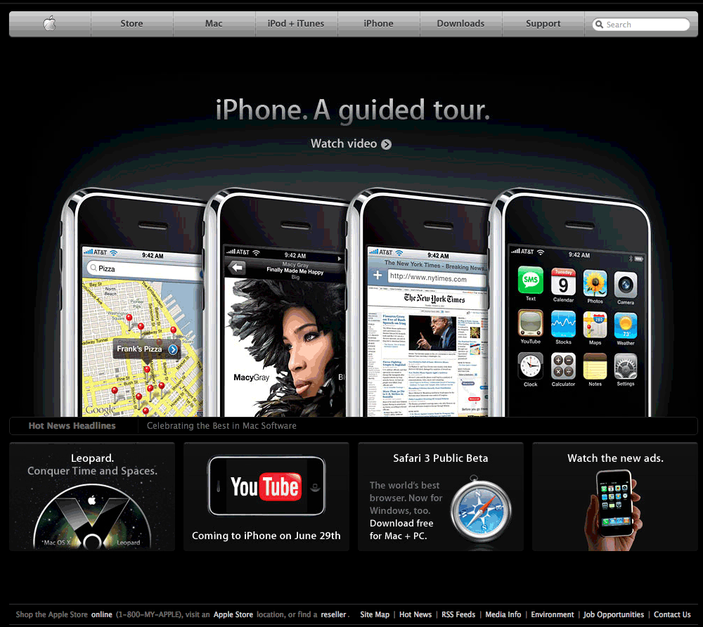
Next we move forward to June of 2007 where we get a huge change.
There are two major updates. First the top navigation changes from the tabbed navigation to a cleaner bar navigation. Second the site changes from a white background to a black background. This design change appears to have been coordinated with the iPhone, released in June of 2007.
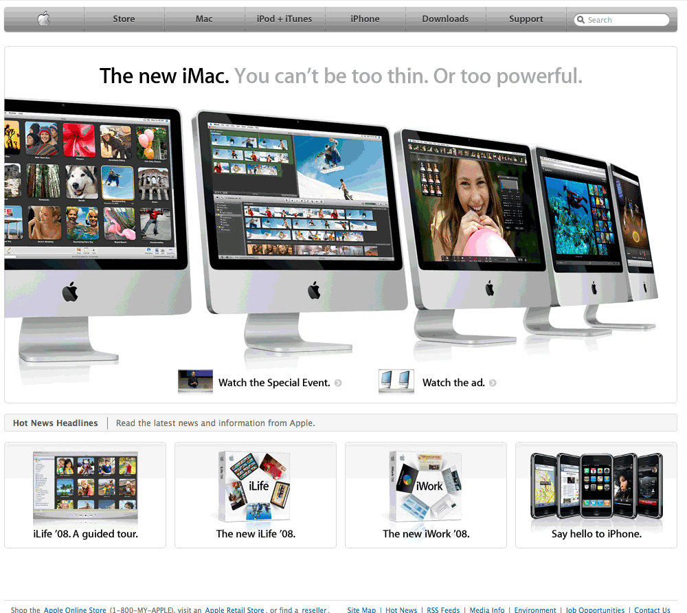
We only have to wait about 30 days for the next update.
In August Apple reverted back to the white background.
The site would once again remain static until January of 2011 and the change would be minor.
The only change after four years would be a darkening of the grey navigation bar. Not much of a change after four years. As of November of 2011 the site has remained unchanged.
For the most part since 1998 the Apple site has not changed significantly. It appears that they had a vision for the site and have stayed the course with minor updates and long periods of no change. Like all Apple products the design is simple and clean, with a understanding of the value of white space. It’s amazing that the seeds of todays site were sown 13 years ago.


